|
|
Post by K5 on Sept 5, 2006 0:20:18 GMT -5
I've been working on a website for TOR and I want to see what everyone thinks of what I've got so far. The main page is almost done. Not all of the links work and the "about us" section isn't quite done. You should get the idea though. Let me know what you think. www.tucsonoffroad.com |
|
|
|
Post by slick1100 on Sept 5, 2006 0:33:31 GMT -5
Looks nice! Only thing I'd suggest is a different background pic. Very well done site though!
|
|
|
|
Post by 99frontierxe on Sept 5, 2006 0:48:30 GMT -5
I would agree about the background pic... also, why is the "about us" in Latin? Just curious.  |
|
|
|
Post by 7Lbar on Sept 5, 2006 0:52:51 GMT -5
I would agree about the background pic... also, why is the "about us" in Latin? Just curious. so we can't understand what Kyle wrote ;D..but X's 3 on the background. |
|
|
|
Post by K5 on Sept 5, 2006 1:00:47 GMT -5
I would agree about the background pic... also, why is the "about us" in Latin? Just curious. I just needed some text to act as a place holder until I get the info written. I just grabbed it off the net. Anyone know what it says? ;D |
|
|
|
Post by K5 on Sept 5, 2006 1:19:14 GMT -5
Ok, here's the problem. I kinda made the main page and the other pages that are almost done around the background pic. I am definitely willing to change it but I just want to know what about the pic should be changed? The whole pic? Just the trucks? Just the sand? It would make my life easier if the sand could stay ;D but it won't hurt my feelings if you guys don't like it. I want to make sure everyone is happy with the new site so don't hold back on your comments or suggestions.
Thanks
Kyle
|
|
|
|
Post by slick1100 on Sept 5, 2006 1:36:44 GMT -5
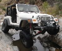
My opinion about the background pic: it should either be a pic of a a TOR member's vehicle, or Tucson scenery. I suggest using the pic of James' Jeep in the water from the Patagonia run with Tucson Off Road clearly visible, or any of the scenery pics from past runs.
|
|
|
|
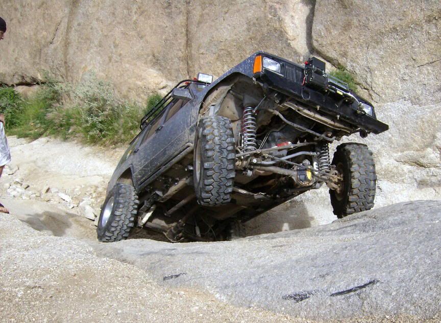
Post by azdesertrhino on Sept 5, 2006 7:57:25 GMT -5
I understand what Kyle is saying about it being a PITA to change but I must say I agree with the picture being changed. I had found this one some time ago and when I was playing with the TOR.com website I had it up, faded and in black and white. Just my 2 cents. ;D  |
|
|
|
Post by Archangel on Sept 5, 2006 8:09:28 GMT -5
I would agree about the background pic... also, why is the "about us" in Latin? Just curious. BEcause thats what most web servers spit out as a default. Kyle asked me to write the section for "About Us" and I was going to do it this weekend...I'll get it done today or this evening...sorry about that guys...The site looks good, but I think we need to select a photograph that represents us better for the background picture... |
|
|
|
Post by slick1100 on Sept 5, 2006 10:04:57 GMT -5
Wow, now that pic Jim posted is awesome looking!!
|
|
|
|
Post by 99frontierxe on Sept 5, 2006 12:08:11 GMT -5
I would agree about the background pic needing to be TOR related... either member's rigs, or a backround pic of Tucson. I have a killer one of Chivo. Maybe we can get together, and have a "photo shoot" of members' rigs, and use something like that. Just my $0.02.  |
|
|
|
Post by 2000taco on Sept 5, 2006 12:38:48 GMT -5
I also agree about the pic needing to be TOR Related. What if you took a bunch of little pics of everyones rig that has made a run, and then create a big picture with tons of smaller ones in it. Hopefully that is not to confusing. The site looks cool so far though.
|
|
|
|
Post by roverob on Sept 5, 2006 15:57:23 GMT -5
I like it.
|
|
|
|
Post by K5 on Sept 5, 2006 17:52:38 GMT -5
I'll mess around with a few different backgrounds and find one that looks good. I'll probably go with Tucson scenery or the pic that Jim posted. I should have the main page done this weekend and the rest of the site done for the meet & greet. Check back for updates.
|
|
|
|
Post by 2000taco on Sept 5, 2006 18:03:48 GMT -5
I'll mess around with a few different backgrounds and find one that looks good. I'll probably go with Tucson scenery or the pic that Jim posted. I should have the main page done this weekend and the rest of the site done for the meet & greet. Check back for updates. My vote is for the tucson scenery since this is TUCSON off road. |
|
|
|
Post by zjeep on Sept 5, 2006 18:27:11 GMT -5
I agree that the pic should at least be of Tucson scenery. Also just another opinion for the members rigs part would it be possible to have it when you click on it a drop down menu come up with makes of vehicles like this... Chevy Dodge Ford Jeep Toyota etc.... something along those lines  ? |
|
|
|
Post by K5 on Sept 5, 2006 19:27:47 GMT -5
I agree that the pic should at least be of Tucson scenery. Also just another opinion for the members rigs part would it be possible to have it when you click on it a drop down menu come up with makes of vehicles like this... Chevy Dodge Ford Jeep Toyota etc.... something along those lines ? I think that is possible with the way I am making the site. I'll have to see. |
|
|
|
Post by azdesertrhino on Sept 5, 2006 19:50:06 GMT -5
Kyle,
Appreciate what you are doing, I know it is a lot of work!
|
|
|
|
Post by K5 on Sept 5, 2006 19:55:26 GMT -5
No problem, I really want TOR to have a good looking site.
|
|
|
|
Post by blluebear on Sept 5, 2006 21:12:17 GMT -5
The new site look great! The layout looks professional. For a background pic...I like the one that AZDEZERTRHINO posted. It has the Tucon background and members rigs. Black and white or color...I still like it. Will the new site link to the current one and save all of the all of the current information posted or is there a way to transfer it to the new site? I think that the original posts should be saved somehow.
Now just a question about the line under "Tucson Off-Road". I understand why that one could be used, but what about "Off-Roading for the family"? Just my .02 cents.
|
|
|
|
Post by K5 on Sept 5, 2006 21:21:06 GMT -5
The new site look great! The layout looks professional. For a background pic...I like the one that AZDEZERTRHINO posted. It has the Tucon background and members rigs. Black and white or color...I still like it. Will the new site link to the current one and save all of the all of the current information posted or is there a way to transfer it to the new site? I think that the original posts should be saved somehow. Now just a question about the line under "Tucson Off-Road". I understand why that one could be used, but what about "Off-Roading for the family"? Just my .02 cents. As of right now I think we will be staying with proboards so all of the posts will stay. We're gonna talk more about that at the meet and greet. As for the line under Tucson Off-Road, I was kinda going for the idea that this group is open to anyone and you don't have to have some serious rock crawler to have fun with us. I do like the "Off-Roading for the family" though. What does everyone else think? |
|
|
|
Post by blluebear on Sept 5, 2006 22:02:23 GMT -5
I will try to think of something to mix the two. Give me a day or two.
|
|
|
|
Post by K5 on Sept 6, 2006 22:17:02 GMT -5
Here's the new version of the site. Let me know what you think. Version 2.0 |
|
|
|
Post by dragon51 on Sept 6, 2006 22:36:40 GMT -5
I do like that picutue it's easy on the eye's, and has a nice look to it the club should have a family feel to it. I went out with another group when I fist got my rig and my wife told me later that she just really did not like the people in that group with excption to a few of the members. So far she has liked eveyone that she has meet with this club. And even James although since meeting him I have spent a lot of money on my pig. ;D
|
|
|
|
Post by slick1100 on Sept 6, 2006 23:01:29 GMT -5
Damn Kyle, that turned out really nice with that pic! I vote for 2.0!
|
|
|
|
Post by zjeep on Sept 7, 2006 0:18:21 GMT -5
Like the new pic Kyle. Was it just my computer or did the site come up really small on the page i couldnt read anything, but the picture looked nice. Keep up the good work.
|
|
|
|
Post by K5 on Sept 7, 2006 1:06:25 GMT -5
Like the new pic Kyle. Was it just my computer or did the site come up really small on the page i couldnt read anything, but the picture looked nice. Keep up the good work. That wasn't the actual site. It was just a jpeg image. I wanted to make sure everyone liked the new background before I made the actual HTML site. |
|
|
|
Post by 99frontierxe on Sept 7, 2006 2:28:25 GMT -5
I like it much more than Ver 1.0 For what it's worth, you get my vote for that one, haha. |
|
|
|
Post by azdesertrhino on Sept 7, 2006 7:06:11 GMT -5
I like it better than #1.
|
|
|
|
Post by 7Lbar on Sept 7, 2006 9:43:42 GMT -5
My vote is for the 2.0 version, great work Kyle.
|
|


 ?
?